Industrial Analytics: Simple Dashboards for Production Visibility
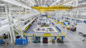
Modern factories generate more data than ever before. Machines record cycle times, sensors monitor vibration and temperature, operators log quality checks, and ERP systems track orders in real time. Yet despite this abundance of information, many plants still struggle with one fundamental issue: lack of production visibility. Data exists, but it is fragmented, delayed, or too complex to interpret quickly.
This is where industrial analytics dashboards become essential. Instead of drowning in spreadsheets or static reports, production teams gain real-time visual insights into OEE, throughput, and downtime analysis. The result is not just better reporting—but faster decisions, improved efficiency, and measurable operational gains.
Why Production Visibility Is No Longer Optional
Global competition has intensified pressure on manufacturers. Margins are tighter, delivery timelines are shorter, and customers expect consistent quality. In this environment, reacting late to production issues can be extremely costly. A two-hour unplanned stoppage might not sound dramatic—but multiplied across shifts and lines, it can quietly erode profitability.
Historically, managers relied on end-of-shift reports to assess performance. By the time issues appeared in weekly summaries, the damage was already done. Today, production environments demand immediate awareness. Supervisors need to know when throughput drops, when downtime exceeds thresholds, and when OEE declines below acceptable levels.
Well-designed industrial analytics dashboards transform raw operational data into clear, actionable insight. Instead of guessing where inefficiencies lie, teams see them in real time—and respond immediately.
What Are Industrial Analytics Dashboards?
Industrial analytics dashboards are digital visualization tools that collect, process, and display production data in a centralized interface. Unlike static spreadsheets or periodic reports, dashboards update continuously, offering live insights into machine performance, line output, and system health.
The difference between raw data and a dashboard is similar to the difference between a list of numbers and a car’s instrument panel. The data may exist, but without structured visualization, it lacks clarity. Dashboards provide:
- KPI tiles for OEE, throughput, and quality rates.
- Trend charts that reveal performance changes over time.
- Downtime breakdown visuals highlighting root causes.
- Machine status indicators (running, idle, stopped).
By combining these elements into one interface, factories gain a comprehensive overview of operations without needing to interpret complex datasets manually.
Industrial Analytics Dashboards and OEE Monitoring
Among all performance metrics, OEE (Overall Equipment Effectiveness) stands out as a foundational indicator. OEE combines three factors:
- Availability – percentage of planned production time that the machine is running.
- Performance – speed efficiency compared to ideal cycle time.
- Quality – ratio of good units to total units produced.
OEE = Availability × Performance × Quality.
While the formula is straightforward, calculating it manually across multiple machines is complex and time-consuming. Industrial analytics dashboards automate this process by collecting real-time production data directly from equipment or MES systems. The dashboard then displays OEE as a live gauge or percentage indicator.
Consider a production line operating at 62% OEE. Without detailed visibility, management might assume performance is acceptable. However, when broken down on a dashboard, the issue may reveal itself: availability at 85%, performance at 80%, but quality only at 91%. This breakdown immediately directs improvement efforts to the quality process instead of mechanical uptime.
Tracking Throughput for Operational Efficiency
Throughput measures the volume of products produced within a given time period. Unlike capacity—which represents theoretical maximum output—throughput reflects real production performance.
Low throughput often indicates bottlenecks, inefficiencies, or hidden downtime. Without analytics tools, identifying these bottlenecks can take weeks of manual observation. Dashboards accelerate this discovery process by displaying:
- Hourly production counts.
- Line-level output comparisons.
- Trend graphs showing deviations from targets.
For example, if Line A consistently underperforms relative to Line B, the dashboard reveals the variance immediately. Supervisors can then investigate whether downtime analysis points to equipment issues, staffing gaps, or process constraints.
Downtime Analysis: Turning Problems into Patterns
Unplanned stoppages are among the most expensive operational issues in manufacturing. Effective downtime analysis transforms isolated incidents into structured learning opportunities.
Downtime typically falls into three categories:
- Planned downtime – maintenance, scheduled changeovers.
- Unplanned downtime – equipment failures, unexpected breakdowns.
- Micro-stoppages – short interruptions often overlooked but cumulatively costly.
Through industrial analytics dashboards, downtime events are automatically categorized and visualized. Pareto charts highlight the most frequent root causes, allowing maintenance teams to prioritize high-impact issues. Instead of reacting randomly to breakdowns, companies can implement targeted corrective actions.
Research across advanced manufacturing sectors has consistently shown that improved digital visibility leads to higher operational resilience. According to industry analyses published by organizations such as McKinsey’s operations and manufacturing research, companies leveraging structured production analytics often achieve measurable gains in productivity and downtime reduction.
From Data Overload to Actionable Insight
Many factories already collect vast quantities of production data through PLCs, IoT sensors, and MES platforms. The challenge is not data availability—it is interpretation. Too many KPIs displayed simultaneously can overwhelm operators instead of empowering them.
Effective industrial analytics dashboards follow three core principles:
- Prioritize critical KPIs – focus on OEE, throughput, and downtime first.
- Use visual hierarchy – large, clear indicators for urgent issues.
- Enable threshold alerts – automatic notifications when performance deviates from targets.
For example, if availability drops below 80%, the dashboard might trigger a red visual alert. Operators immediately recognize the issue and intervene before losses escalate. Instead of discovering problems hours later, the response window shrinks to minutes.
This shift—from retrospective reporting to proactive intervention—is what makes analytics dashboards transformative. They do not merely describe performance; they actively shape it.
Designing Simple but Effective Dashboards
Simplicity is often underestimated. A cluttered dashboard filled with dozens of metrics can create confusion rather than clarity. The most effective industrial analytics dashboards emphasize simplicity without sacrificing depth.
| Dashboard Section | Recommended Content |
|---|---|
| Top Panel | OEE %, Throughput rate, Downtime hours |
| Middle Panel | Machine-level status indicators |
| Bottom Panel | Trend charts and downtime Pareto analysis |
By structuring the dashboard logically, managers can absorb critical information in seconds. This design philosophy ensures analytics serve production—not distract from it.

Technology Behind Industrial Analytics Dashboards
Behind every effective industrial analytics dashboards implementation lies a structured data pipeline. While the interface may appear simple, the system integrates multiple layers of industrial technology. Production data typically originates from PLCs (Programmable Logic Controllers), machine sensors, or SCADA systems. These signals are collected and transmitted to a data processing layer—either on-premise or cloud-based—where analytics engines calculate KPIs such as OEE, throughput, and downtime analysis in real time.
The simplified data flow looks like this:
- Machine signals (cycle time, stop events, output count)
- Data acquisition layer (IoT gateway or edge device)
- Analytics engine (KPI computation & logic rules)
- Visualization layer (dashboard interface)
Cloud-based systems offer scalability and remote access, making them suitable for multi-site operations. On-premise deployments, meanwhile, may be preferred in facilities with strict data security policies. Regardless of the infrastructure choice, the objective remains the same: convert raw machine data into production visibility that decision-makers can act upon immediately.
Practical Benefits: What Companies Actually Gain
The real value of industrial analytics dashboards becomes clear when examining measurable outcomes. Organizations that implement structured production visibility systems frequently report:
- 10–20% reduction in unplanned downtime.
- 5–15% improvement in throughput.
- Faster root cause identification through downtime analysis.
- Improved cross-shift communication and accountability.
Consider a mid-sized factory operating three production lines with annual revenue of $25 million. If analytics dashboards increase throughput by just 8%, that could represent $2 million in additional productive capacity—without purchasing new equipment. Similarly, reducing downtime by even 12% might recover hundreds of production hours per year.
These gains compound over time. Better visibility enables smarter maintenance scheduling, improved operator training, and more accurate production forecasting. Instead of reacting to crises, teams move toward continuous improvement driven by data.
Industrial Analytics Dashboards for Different Scales
Small Workshops
For smaller operations, industrial analytics dashboards do not need to be complex. A streamlined solution focusing on OEE and downtime analysis can already create substantial impact. Lightweight IoT devices connected to a cloud dashboard allow workshop owners to track throughput daily without heavy IT investment.
Mid-Sized Factories
Mid-sized manufacturers typically benefit from integrating dashboards with MES systems. This setup allows multi-line monitoring, automatic job tracking, and deeper downtime analysis. Supervisors can compare shift performance, identify bottlenecks, and adjust production schedules in near real time.
Large Industrial Plants
Enterprise-level facilities often deploy centralized industrial analytics dashboards across multiple sites. These dashboards aggregate data from dozens—or even hundreds—of machines. Advanced systems incorporate predictive analytics, energy monitoring, and cross-facility benchmarking. Executives gain visibility not just into a single line, but into the entire operational network.
Common Mistakes in Dashboard Implementation
Despite their advantages, dashboards can fail if poorly implemented. Common mistakes include:
- Too many KPIs: Overloading the interface reduces clarity.
- No operator training: Users must understand what metrics mean.
- Lack of action plan: Visibility without response yields no improvement.
- Static display usage: Dashboards should drive decisions, not serve as decorative screens.
Successful deployment requires aligning metrics with operational goals. If the objective is to improve OEE, then the dashboard must clearly show availability, performance, and quality breakdowns—alongside actionable downtime analysis data. Metrics should answer questions, not raise confusion.
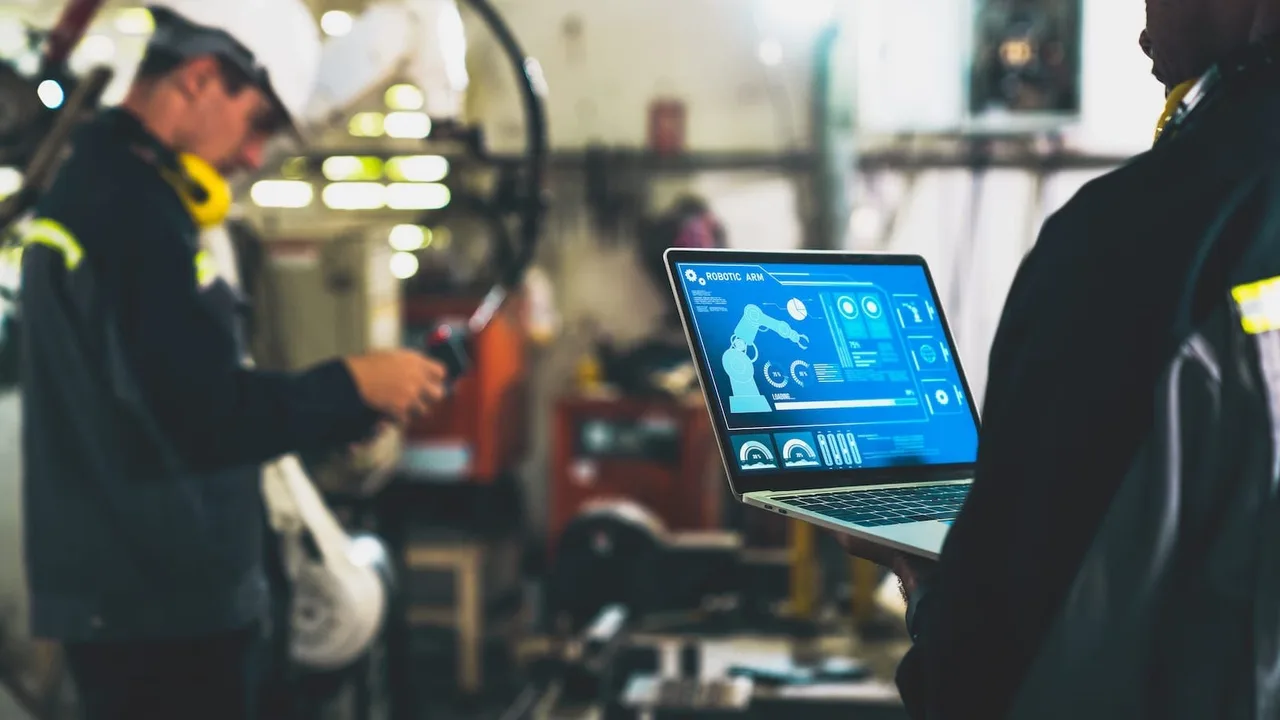
Future Trends: AI and Predictive Production Monitoring
The next evolution of industrial analytics dashboards involves artificial intelligence and predictive modeling. Instead of merely reporting past performance, AI-driven systems forecast future disruptions. For example, vibration sensors can detect anomalies suggesting an upcoming mechanical failure. The dashboard then alerts maintenance teams before downtime occurs.
Predictive maintenance models are becoming increasingly sophisticated. Machine learning algorithms analyze historical throughput patterns and downtime analysis logs to identify recurring failure sequences. Over time, these systems reduce unexpected stoppages and improve asset lifespan.
Another emerging trend is sustainability integration. Energy consumption per unit produced can now appear alongside OEE and throughput metrics. This capability supports ESG reporting and helps companies track efficiency improvements beyond pure production volume.
Visibility Is Competitive Advantage
Manufacturing success today depends on clarity. Without visibility, inefficiencies remain hidden, downtime persists, and throughput stagnates. With structured industrial analytics dashboards, production teams gain the power to see problems early, act decisively, and continuously refine performance.
By integrating OEE monitoring, throughput tracking, and structured downtime analysis into simple, well-designed dashboards, factories move from reactive management to proactive control. The transformation does not require overwhelming complexity—only disciplined focus on the right metrics and consistent use of real-time insight.
In competitive industrial markets, production visibility is no longer a luxury. It is a strategic necessity. Companies that embrace analytics-driven operations position themselves for sustained efficiency, stronger margins, and long-term operational resilience.